![]() How are the SuitePad in-room tablet installations designed, what does the interface look like, and how can you take advantage of the opportunity to showcase your hotel's unique branding?
How are the SuitePad in-room tablet installations designed, what does the interface look like, and how can you take advantage of the opportunity to showcase your hotel's unique branding?
In today's fast-paced market, businesses must create products tailored to their guests' specific needs and preferences. By crafting customized products, companies can satisfy their target audience and stand out from the competition. One of SuitePad's unique selling points is our bespoke design that aligns with your hotel's corporate identity and design. Our dedicated Content Managers carefully integrate your branding into the tablets' software, creating a final product that is one and dear to your hotel.
In this blog post, we will explore the design process of SuitePad in-room tablets and take a look at examples of exciting and unique installations from our customers.
The SuitePad Onboarding Process
After signing the contract, the onboarding process begins. This typically takes 6 to 8 weeks, depending on the inputs received from the hotel. Our valuable Project Managers assist you with your onboarding to make sure everything works smoothly. We offer a fast-track onboarding option for hotels that promptly provide all the necessary information.
 1. The Kick-off Call
The onboarding process starts with a kick-off call between the hotel and the SuitePad team. During this call, the team discusses the hotel's requirements and sets expectations for the onboarding process.
2. Uploading the Necessary Elements
After the kick-off call, the hotel is given time to upload all the necessary elements for the creation of the installation, including content files, texts, images, and network information. This information is essential for the Content Team to customize the installation to match the hotel's branding and requirements.
3. Customization
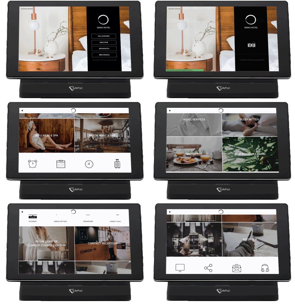
Once the Content Team receives all the necessary information, they begin customizing the installation based on the hotel's unique needs. To show you an idea of what your tablets could look like, the team creates the installation based on your hotel website and social media before the preview call, using pre-made designs and modifying it from there. They (see below) are created with stock images and standardized texts. This is the base of the design, which will be adjusted to match the new customer's branding. In case the hotelier prefers to use these designs instead of sending all of the content for customization, this is also possible.
4. The Feedback Round
During a feedback round in written form with the Project Management team, the hotel can request modifications to the installation and let the team know the features and add-ons they would like, such as VoIP, PMS systems, BYOD, lobby solutions, chat functions, and more.
5. Finalization and Installation
After the hotel provides feedback, the Content Team reworks and finalizes the installation's content. The pre-installed devices are then shipped to the hotel, and deployment begins. This includes a content and operational training session to ensure that the hotel staff can use the in-room tablets efficiently.
Design Examples for Individual Hotels
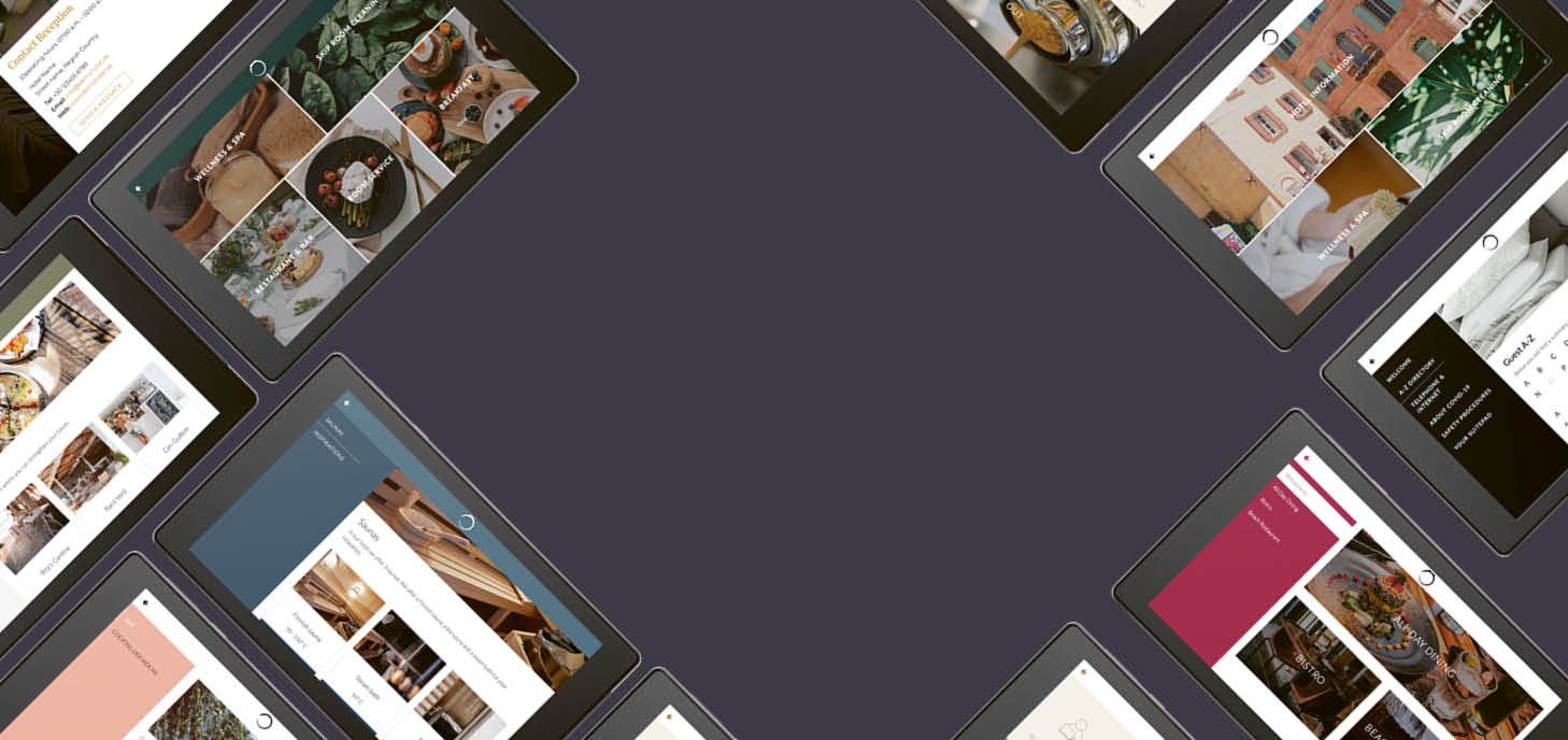
Our design examples, specifically tailored for various types of hotels, are created by our Content Team to act as a helpful guide. They assist hoteliers in shaping their vision and choosing designs that perfectly match the desired atmosphere and ambiance of their establishment. With a wide range of design options available, hoteliers can confidently navigate the creative process, ensuring their hotel reflects their unique style and branding.
SuitePad for City Hotels
The first design example of city hotels focuses on being minimal and has a neutral color scheme. It features images of the city, and the tiles are designed with the main demographic of city hotels in mind: business travelers and city explorers.
The second example is similar yet different from the previous one. This design has warmer tones and vibrant colors such as brick reds and sky blues, and it fits well with the aesthetic of southern European cities.
You can find more information on SuitePad for city hotels here.
SuitePad for Wellness Hotels
The first example for Wellness Hotels is designed to reflect the relaxing nature of leisure travel. It features warm colors, beaches, and images with abundant sunlight.
The second installation example utilizes natural colors like dark greens and oranges. In addition, the design features images of Nordic forests, animals, and plants.
You can find more information on SuitePad for wellness hotels here.
SuitePad for Design and Lifestyle Hotels
The Design and Lifestyle Hotel installation example reflects a clean aesthetic with modern imagery. However, it has more pastel and warm tones, and images in the food-related sections feature healthy dish options.
The installation includes a warm welcome message that the hotel can customize to reflect its unique design or add a designated tile for interactive events the hotel offers to its guests.
You can find more information on SuitePad for design and lifestyle hotels here.
SuitePad for Beach Resorts
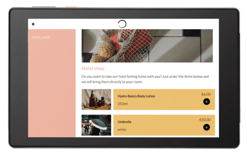
This example is designed to fit well with the vibe of resort vacations. It has delicious-looking foods and colorful images and features beaches and warm weather.
The installation has a tile for the hotel's family program that gives information on kid-friendly activities for guests with children. It also features a map of the resort to make navigating within the premises easier.
You can find more information on SuitePad for beach resorts here.
SuitePad for Luxury Hotels
The Luxury Hotel installation example features dark, moody tones and has a golden accent color. It is designed to reflect the elegance and poise of luxury hotels.
There is information on the hotel's airport transfer, and taxi services as well as the hotel's exclusive terrace bar.
You can find more information on SuitePad for luxury hotels here.
SuitePad for Mountain Resorts
The Mountain Resort installation has an abundance of pastel colors, and the images featured focus on nature and mountainside imagery. In addition, the tiles are designed with the active demographics of the hotels in mind.
The installation features two titles that are dedicated to the winter and summer seasons, highlighting the activities that are specific to each one.
You can find more information on SuitePad for mountain resorts here.
SuitePad for Serviced Apartments
This installation is very minimal, and the general aesthetic is designed to make it feel more homely. Scandinavian architecture is featured in the images, and the tiles are structured in a way that can help the guest have a smooth stay in an aparthotel.
Any information on the apartment is conveniently organized with an A-Z list and there is a special tile for ordering take-out, featuring well-known delivery apps.
You can find more information on SuitePad for serviced apartments here.
Unique Customer Installations
The designs of the installations can be entirely changed according to your desires and view. Some hotels like to stick to our pre-made designs, but some hotels have a particular aesthetic in mind. Here are a few examples of unique hotel installations from our customers.
Euston Square Hotel
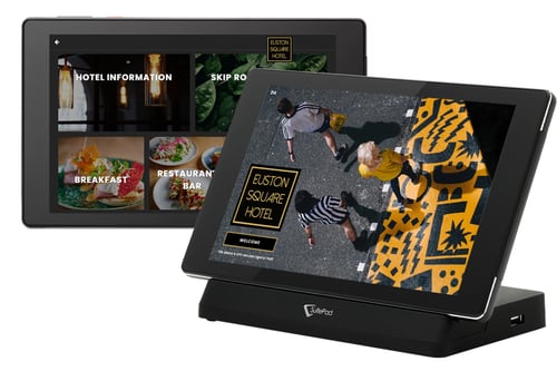
This modern and stylish boutique hotel in London is a great example of the wonders of a consistent brand image. From their logos in the installation to the accent colors, Euston Square Hotel sticks to specific color schemes, making it easy for the guests to identify and remember the hotel and its aesthetic.
The installation features images from the hotel's interior and uses images to reflect the clean and sleek aesthetic of the hotel. The hotel uses two primary colors in the design: black and yellow. This allows the installation to flow seamlessly and have a unified vibe.
Read more about our collaboration.
Radisson Hotel & Suites Amsterdam South
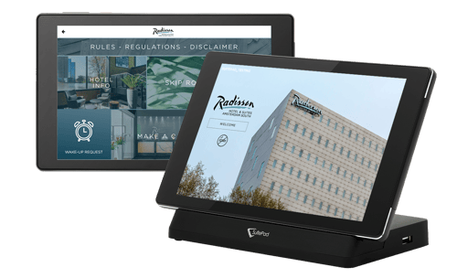
The Raddison Hotel's installation is explicitly designed to reflect the corporate aspect of this hotel chain. The color scheme, featured images, and the tiles' layout mirror the hotel group's visual identity.
The installation features images of the hotel and the outside view of the hotel building. The overall design aligns with the hotel's business travel focus, and the professional visuals of the installation are consistent with the hotel chain's branding.
Read more about our collaboration.
The Lanesborough in London
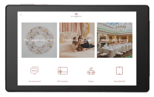
The Lanesborough London's installation is an excellent showcase of how a hotel's visual identity can be integrated into every aspect of the guest experience. The installation has an elegant flare that blends well with the property's classical style.
The color scheme mirrors the hotel's logo, utilizing the regal burgundy, a very fitting color for the property's renovated 18th-century castle aesthetic. The installation features the beautiful classic interior of the hotel itself, bringing together the signature English architecture of the hotel with modern in-room tablets.
Read more about our collaboration.
Conclusion
A consistent design means a strong brand image. A strong brand image means an easily identifiable establishment. This then leads to customer loyalty. And isn't this what hotels are looking for? Take advantage of the opportunity to showcase your hotel's unique branding to your guests directly in their rooms.
📸 Copyright: SuitePad Screenshots
Published on July 18, 2023
%20EN.png?width=500&height=317&name=Design%20example%20for%20City%20Hotel%20(City%20North)%20EN.png)
%20EN.png?width=500&height=317&name=Design%20example%20for%20City%20Hotels%20(City%20South)%20EN.png)
.png?width=500&height=317&name=Design%20example%20for%20Welsness%20Hotels%20(Mock%20up%20EN).png)
.png?width=500&height=317&name=Design%20example%20for%20Wellness%20Hotels%20(Mock%20up%20EN).png)
.png?width=500&height=317&name=Design%20example%20for%20Resort%20Hotels%20(Mockup%20EN).png)
.png?width=500&height=317&name=Design%20example%20for%20Luxury%20Hotels%20(Mockup%20EN).png)
.png?width=500&height=317&name=Design%20example%20for%20Mountain%20Hotels%20(Mockup%20EN).png)
.png?width=500&height=317&name=Design%20example%20for%20Serviced%20Apartments%20(Mockup%20EN).png)

.png?width=100&height=100&name=Bastien%204x4%20(11).png)
.png)
